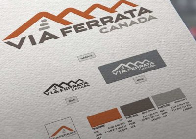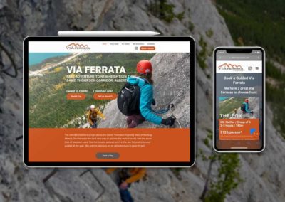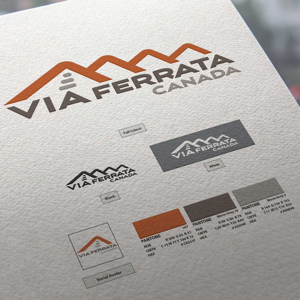
We did some commercial photos up on “The Fox” via ferrata in Nordegg, and in conjunction with that, did a refresh of Mike’s existing Wix website. Since no logo existed at the time, we needed to quickly build one to rapidly deploy photography on the new website skin.
The logo itself is a rendition of the repeating skyline you often see in David Thompson Country. The website is more or less as it was in Wix when we logged in, with attention paid to helping unify the branding, colours and fonts. Of course the custom photos we did are also integrated in the layouts. Finally, a quick run through some basic SEO has vastly increased search rank.
Have a look at www.viaferratacanada.com, it is a really good example of a smaller proejct where we were more in a support role to rapidly deploy assests.
Details
Client: Via Ferrata Canada
Industry: Tourism & Guiding
Service Area: David Thompson Country, Alberta


