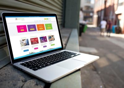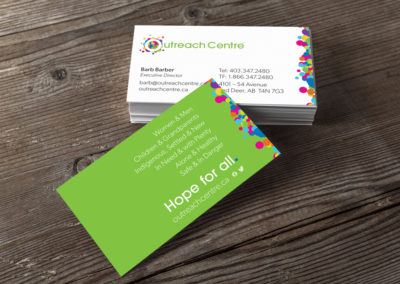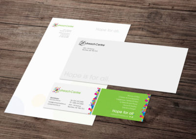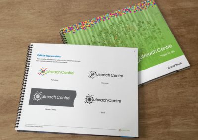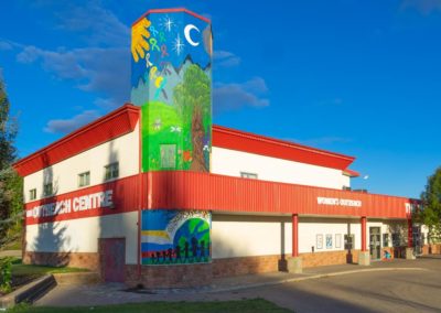
We’ve helped out the Outreach Centre for many years now and seen a lot of growth and change. In that regard, it was great to be able to walk through a visual rebrand.
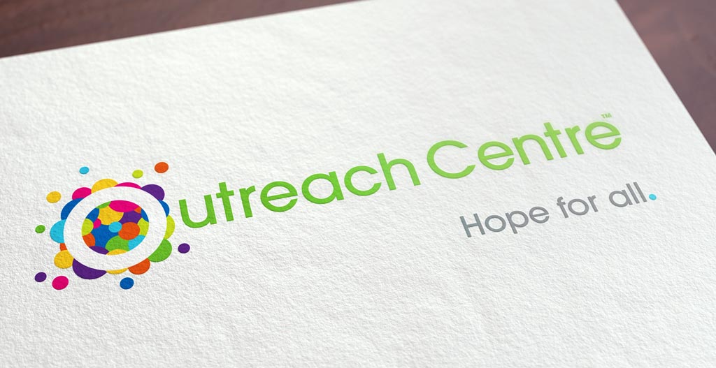
In human services, it’s difficult to represent everyone and everything an agency does; it’s like representing infinity. The brand anchors on the tagline ”Hope for all.” The visuals are quite simply a bird’s eye view of the people, flowing, pulsing in and out, colours sizes and shapes, everyone.
This brand exploded to life. In design, we often get hung up on application, technology, outcome – but in rare moments you see fireworks. This brand was one of them. I am so grateful to play a small part in the Centre’s history.
The Outreach Centre’s website can be found here
Details
Client: The Outreach Centre
Industry: Human Services/Non-profit
Service Area: Central Alberta

