I’ve been talking a lot about content lately and thought to myself this weekend: “I’ve got another good point… Photography!“
I wrote last year about photographic creativity, so this is not so much about that. This is more about how to manage the photographic process as it relates to marketing. Most marketers have two avenues for acquiring photography assets: professional and in-house. Professional photography always gets better results. In house photography is always cheaper and results are questionable, and this age of large mega-pixel digicams proves bigger isn’t better.
Now, I’m not trying to say I’m a good photographer with these tips, but I am a pretty good art-director (and modest, too), and I’ve seen a lot of interactions with clients and ‘photogs’. For a photographer’s thoughts, read this comment to one of my previous posts. What I really want readers to get here, is that the process takes time and money, but it means the difference between a mediocre piece of communication vs. something that truly moves people and will illicit a reaction.
Let’s break it down.
In-House
 It’s really tempting and very easy to quickly crack off a few frames and supply them to a design team like us. That’s true, and sometimes that’s fine. Without acting as a photography instructor, here are a few tips for the in-housers out there:
- Bigger isn’t better. Megapixel number doesn’t mean image quality. It simply is a measure of file size. Large files can still suck.
- Focus is more important than mega-pixels. Most digicams focus in a reasonably odd way (in my opinion). If you don’t know how to focus your camera, make sure you take multiple frames in the hopes of hitting one. And shoot vertical and horizontal.
- Turn the @!@#! flash off! Digicams have terrible flashes. They are like starting a barbecue with gasoline. Shooting with a digicam flashes just burns people eyebrows off.
- Clear subject matter is more powerful than a busy shot showing too much. Be very clear. Most of your photos will be used quite small, so they need a clear subject. The simplest interpretation of this is to pick the important detail and make it LARGE.
- Shoot with your back to the light source, at at least perpendicular to it. A cardinal photographic rule, just do it.
- Sorry, but the big conceptual cover shot just isn’t happening. It takes a lot to pull off large scale photographic projects. Statistically speaking, I’ve hardly ever seen a supplied photo result in an award winning concept.
This age of large mega-pixel cameras proves bigger isn’t better.
Professional Photography

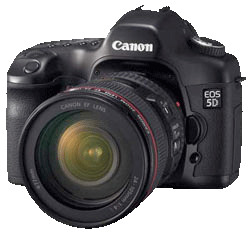
- The big camera and expensive lenses aren’t a silver bullet. Any one taking a good photo needs to execute a creative process. This takes time. Shuttling a photographer on a rapid fire trip through multiple locations is high risk. Give it time. Many scenes take at least an hour to execute. I’ve seen photographers shuttled through scenes in 10 minutes or less – with the expected mediocre results.
- Allow for staging and be prepared to help. The people matter. The day matters. The light matters. Everything matters. Setting a shot takes a bit of pre-planning and some effort to acquire props, people and other subject matter. Be prepared to get ready, or allow the photographer budget to do it.
- Try to have a goal. You are marketing. Marketing is communication. What are you trying to say? What does the design team want to say, how does the photographer interpret the concept? This is important and helps set the tone for the shoot.
- Style? Loose or tight? Staged or journalistic? There are many styles to interpret any piece of subject matter. Which one works best? Discuss it.
- Understand that modern digital photos are edited. Every photo from a DSLR and many digicams is processed and takes a couple rounds of edits to ensure the highest quality image. The proofs you receive are a shadow of what they can become. It is tempting to use the proofs on a website project since they will be “big enough”, but they will not be their best. I always temper this a pragmatic approach, though – sometimes an unedited proof is still better than nothing.
The bottom line is, photographic assets are invaluable. A little effort is the difference between amazing and lukewarm work, but that effort is well worth it.

0 Comments