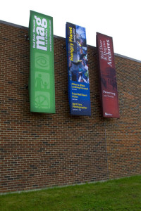
So much of the design and communications industry is based on speed these days. Printing presses are built for quick turnarounds, websites are updated in moments and twitter sends information in seconds. Well today we saw the completion of a project that has actually been on the books for over two years!
 The Red Deer Museum + Art Gallery has been undertaking a massive revitalization for the past 3-4 years with major renovations, new staff, new programs and a new ability to host national level exhibits, the MAG is truly not the Museum we might remember. We were asked in the midpoint of 2008 to start looking at new exterior signage for the building. We had a couple of good shots at solutions over the years, but nothing was ever approved.

Sometimes we’re fast, and sometimes we’re slow, and all the time we’re happy to see a terrific finished product!

Great work! And you’re right, they look really good live….drop by and have a look…and then go in and check out Dwight Arthur’s excellent photos in the Red Deer Eats exhibit.