![]() I’ve been working with pantone for roughly 25 years. In that time Pantone has been a comfortable safe pace. A place where colour nerds could wonk out about 5% differences in hues. Those days seem to be mostly over.
I’ve been working with pantone for roughly 25 years. In that time Pantone has been a comfortable safe pace. A place where colour nerds could wonk out about 5% differences in hues. Those days seem to be mostly over.
Pantone Connect verdict?
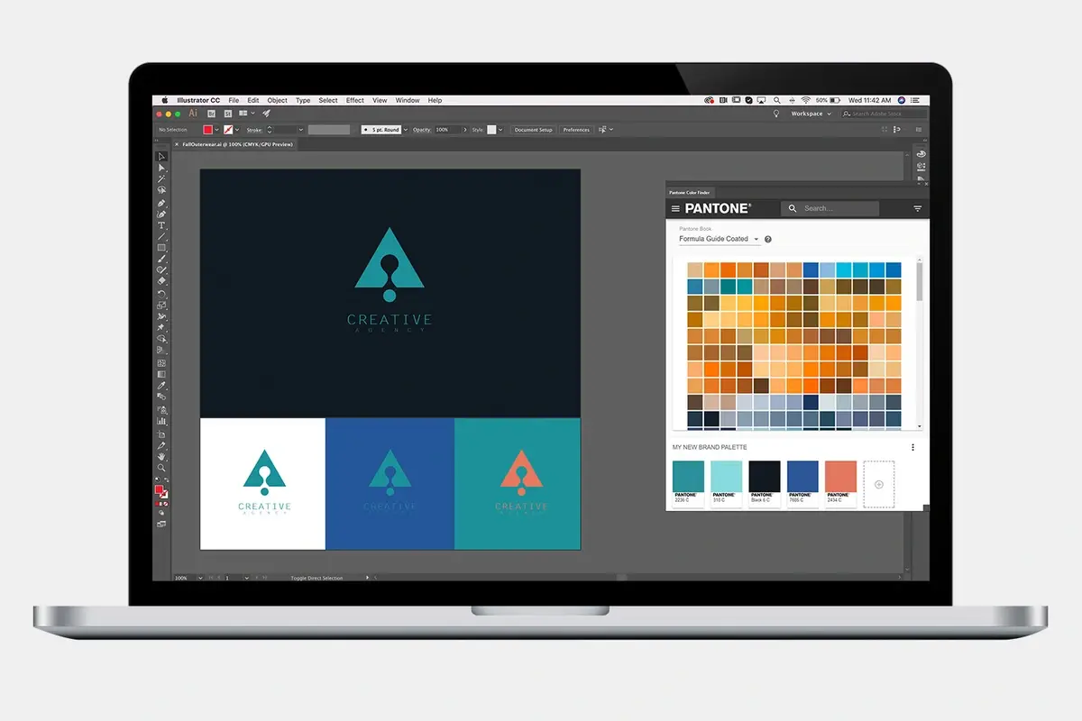
Pantone Connect is the drunk uncle in your sidebar.
It’s like Clark Griswold paying for Eddie’s kids Christmas presents in Christmas Vacation. You do it because you kind of have to. But in the end you get no presents and have less money. Pantone Connect is clumsy, very slow and tries to repeat functions that Adobe already had with CC Libraries. Its only grace is that its interface is basically the same in-software as it is online, so you are consistently disappointed.
By its own admission, Adobe switched to “Pantone Plus” a few versions back, and colours changed. My experience has been that no two CMYK conversions are the same. Book values from a few years ago (or months) are different. Remember though, RGB/CMYK values are actual more of an interpretation of an ink than an absolute. Our design tools, screens and presses don’t have absolute gamut to display everything.
Calibration for the win?
Maybe
If you don’t, you should calibrate Adobe software colour profiles. I’ve got a few rules:
Monitor Colour
- Most Apple monitors don’t offer much calibration other than white point, so at the very least, make sure brightness on-screen is 100% up when doing this kind of work.
- Tell clients to review colour specific drafts on smartphones. They have much better screen brightness and colours than the average office zombie Dell workstation.
CMYK Profiles
- Unless you need something else, I use US Sheetfed Coated V2. It’s proven most consistent in my area.
RGB Profiles
- sRGB for web, generally speaking
- Colormatch RGB for print applications
- Adobe 1998 RGB for photos that will be printed (AKA photo prints)
Build a set of Profiles in Photoshop. Then Go to Adobe Bridge>Edit>Color Settings and use the new ruleset you just made in PhotoShop… and synchronize across software.
Real Life Example
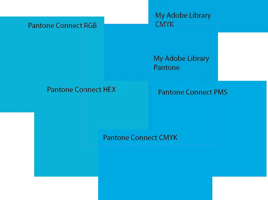
Consistently inconsistent.
This image is showing the difference in colour for Pantone 2995 CP using the numbers straight out of Pantone Connect at the time of writing. You can see the web designer using the RGB or HEX numbers will be unhappy. Looking closely, even the right side that looks similar is different swatch to swatch.
Illustrator vs Indesign
Let’s not forget to mention… Adobe cannot even make the oddball colour data it receives make any sense. Pantone colours can look different in Illustrator AND Indesign WITH a calibrated colour profile system as noted above. I have not solved this one yet.
Solution?
Designers need to stop promising absolutes
1. Use LAB values or leave Pantone unchanged.
Pretty much everyone agrees LAB is probably the best if you do not use the Pantone specified colour. For the most part, for PRINT, leave Pantone swatches unchanged and let the printer RIP software do the conversion based on their calibration and updates.
1. Use HEX values and start in Illustrator.
I have seen the most consistency using a hex value (#123456) and letting the RGB or CMYK convert to whatever it does. For me, I build a file, a logo for example, and add the pantone swatches from Pantone Connect, and then build a second set of swatches in either RGB or CMYK using the hex code as it appears in the pantone swatch. These swatches become my foundation.
I’m not there 100% yet, but I am close to only supplying a Pantone and a HEX when creating brands. Feels like a wild full moon party in Thailand compared to the olden days when we made CMYK matching a religion. But here we are.
How do you get Pantone into Adobe without paying?
At this point, much pain and suffering. I have tried to hack this for roughly 2 years, going back to Pantones expansion of colours that weren’t in my old books. I even found this lovely Git that wont’t work anymore. I think you have two choices:
1. Use ~something~ online and convert and RGB or Hex into a custom swatch in Adobe
Probably less accurate, and I don’t think I’d use this for a big brand, but it will get you 90% of the way there. In this world, we use RGB or Hex more anyway. If you do a few tests with your printer, you can get close.
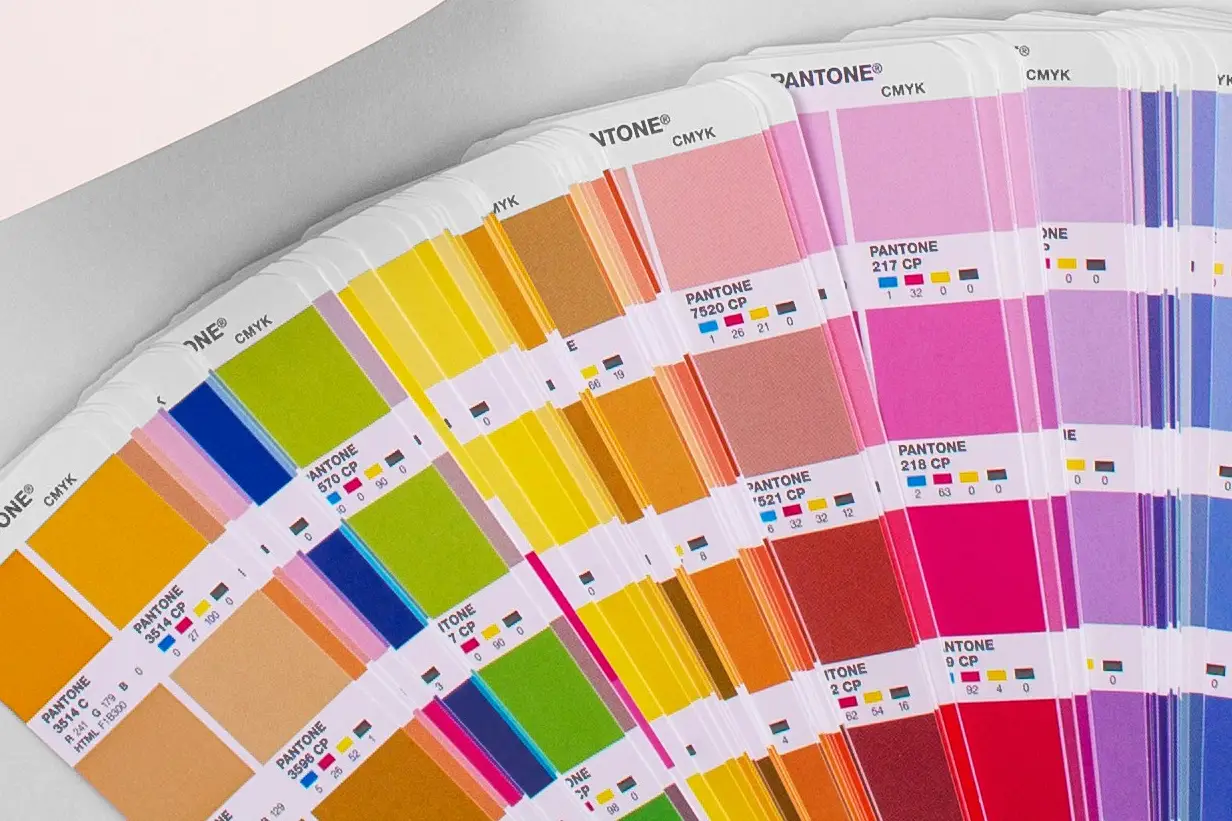
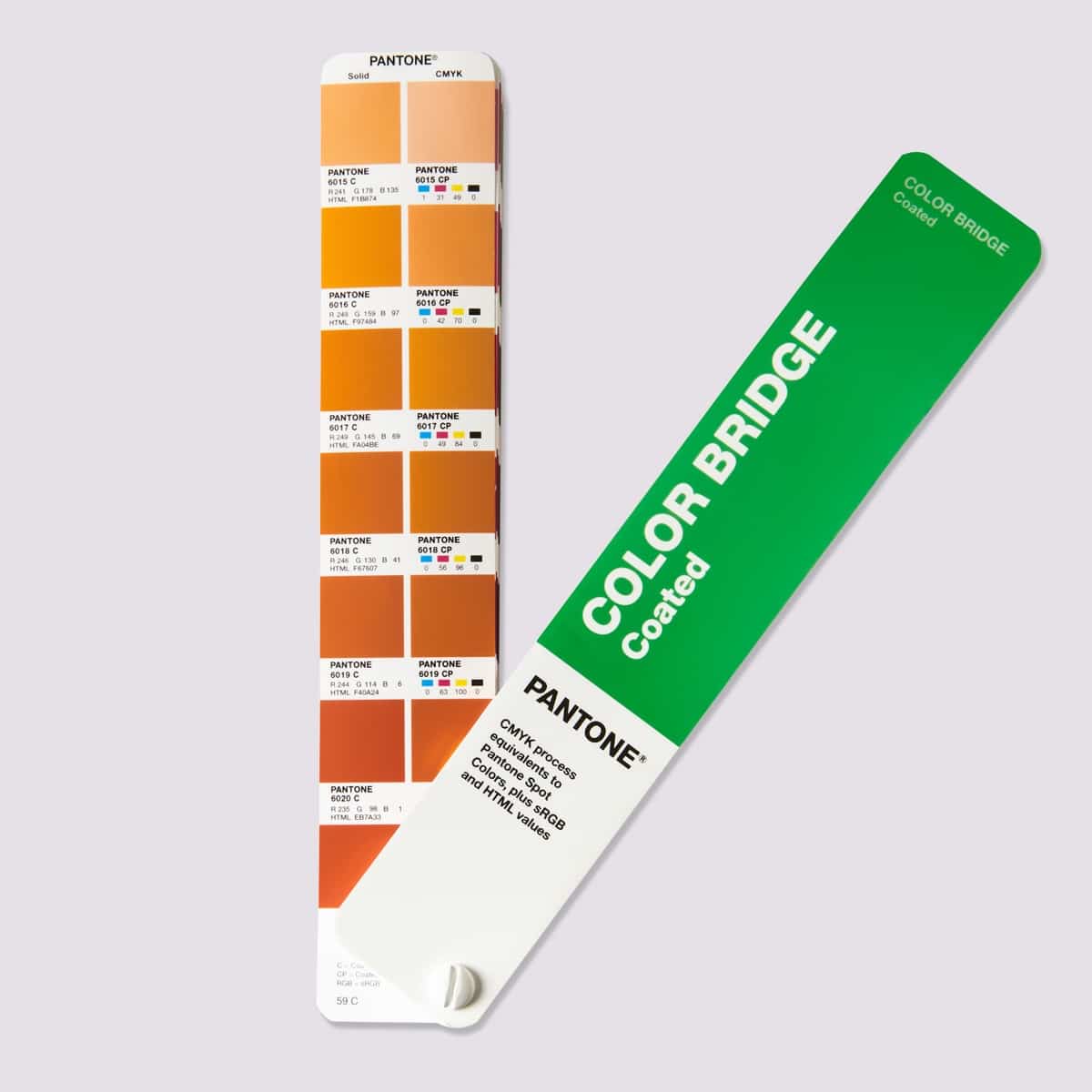
2. Buy the Pantone Color Bridge CMYK swatch book.
I think this is the real answer for me. If you buy a physical book, you will be free from the war that is wrecking all of our workflows. You can find more or less the Hex and RGB numbers online. This gets your brand guidelines document out the door.
Remember, in the olden tymes, we all did colour tests to approve CMYK breaks. People PAID for them. It was part of the process. We’ve all gotten so lazy and expect everything to be free, and it’s not.
If a client is asking for an absolute, an actually printed test is the only way to achieve their goals. It costs your time, and printing costs. If they want it to be cheap or free … I’d also like a free Tesla.
Conculsion
Long term, I cannot see paying for Pantone Connect.
I can see buying a physical swatch book and keeping it up to date. Then I can make my own custom swatches. Maybe someday the revenue war between these behemoths will be resolved, until then, all of us will just keep having to make it all work. Let’s all agree to teach end users that absolute colour is less possible today than it was yesterday, and realize that 5-10% variance in colour is normal in this age and get moving, and stop bogging down on this issue.


0 Comments